App Research
I researched different "Jack the Ripper App". First I looked at iTuner Store:
TV episodes and books
Podcast
I downloaded some Apps to try them:
Jack the Ripper the Virtual Tour
- It is a virtual tour with details of the murders.
- The main navigation is through the victim murder details, some details are presented such as: Photo, Name, Date, Location, Method, video made by the App company, Newspaper, Get directions to the actual murder scene, see murder scene through London Map and Detail about the murder.
- Pull directions from Google to direct the user to the scene.
- It doesn't work well landscape, and the visual are no aesthetically appealing.
Jack the Ripper
- It is a Game, a detective introduce you to the scene and give instructions, you enter in different scenes and need to find stuff.
- It's a sequence of actions, until you finish one step you cannot carry on.
- The graphics are relate with the Victorian era, or make the feeling of.
- The use flares to draw attention to the different clues.
- I don't like to be interrupted to give instructions, I would like to be more intuitive and give the option for ask for help if I need it.
Real Crimes - Jack the Ripper
- It is a Game, you will need to help the investigators to find clues about the assassin. I cannot get into the Game as it's asking me for my name, and It just put the keyboard for me to type in.
- It is interesting look a the graphics the buttons look like Victorian frames, but there is a mix of styles, which can confuse me.
Comics in the classroom.
- It's the story presented as a comic format.
- The visuals and style of the comic it's inpiring.
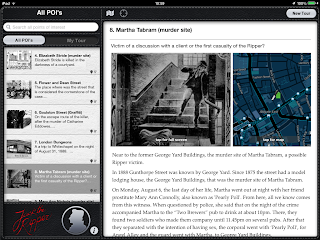
Jack The Ripper - Liam Nile.
- "Liam Nile brings you his first premium historical guide of Jack the Ripper tailored for your iPad! This app generates the best and enlightened offline tour experience!" http://www.liamnile.com/html/jackfile.html
- Excellent information for research, but for the common tourist it's heavy base on text, it is hard to read on the iPad with Sunlight.
- It's offline, you can use the map and compass but it doesn't actually doesn't give directions.
- The navigation is intuitive and simple, the design also is simple using white space and a few dark colour.
- Into the section about as, it reference the source of the material that has been show (prints/ pictures)
- The map is outsource from http://www.openstreetmap.org/#map=6/51.399/-0.363
- It shows another point's of interest related with the era, different with the murder scene.
- The quality of the Print it's not good, but I would think that it's hard to find a HQ one, as they are old documents and delicate.
- The Royal London Hospital Archives and Museum, a good source of information to research. http://www.medicalmuseums.org/Royal-London-Hospital-Museum-and-Archives/


No comments:
Post a Comment