Flow Diagram
A visual representation of the processes into the app, showing the flow of the user's task through about. It is a overall overview how the app would work.
General Guidelines:
Sources:
- Modify. Tablet web design Best Practices. Available at: http://www.mobify.com/go/tablet-web-design/
- Jakob Nielsen and Raluca Budiu. (2011) Usability of iPad Apps and Websites. 2nd edition. Available at: http://www.nngroup.com/reports/ipad-app-and-website-usability/
- Apple developer. (2013) iOS Human Interface Guidelines. Available at: https://developer.apple.com/library/ios/documentation/userexperience/conceptual/mobilehig/MobileHIG.pdf
- http://webstyleguide.com/wsg3/3-information-architecture/4-presenting-information.html
Splash Screen/Launch Images:
- "Several new iPad apps have long introductory segments that might be entertaining the first time, but soon wear out their welcome. " (Nielsen, p 9)
- Do not use animations, noises and videos when app is Launched (Nielsen, p 86)
- If you must have one, do it as close as your first functional screen. (Nielsen, p 86) the user would think that the App is fast (Apple p 26)
- "It’s best when users can begin using your app immediately." (Apple, p 25)
- "A launch image is a simple placeholder image that iOS displays when your app starts up....You must provide at least one launch image" (Apple p 201)
- "If you think that following these guidelines will result in a plain, boring launch image, you’re right. Remember, the launch image doesn’t provide you with an opportunity for artistic expression. It’s solely intended to enhance the user’s perception of your app as quick to launch and immediately ready for use." (Apple p 201)
Screen:
- Use the whole screen (Nielsen, p 43) (Apple, p 10)
Touch areas:
- Good size, min 44px (Modify, p 8) / min 1 cm X 1cm(Nielsen, p 7)
- Need to be look as touchable. (Nielsen, p 7 and 32)
- Breath space / padding (Nielsen, p 31)
- Use negative space in order to draw attention (Apple, p 13)
- Colour can indicate interactivity (Apple, p 14)
- "An icon or a title that provides a clear call to action invites users to tap it." (Apple, p 43)
Typeface:
- Readable. Size min 16px, Line height 1.5 (Modify, p 11) (Nielsen, p 7)
- Check this link http://www.google.com/fonts/ for font based icons. (Modify, p 12)
- Do not squeeze too much information in one place. (Nielsen, p 8)
- Use system fonts (Apple, p 15)
- Use a single font (Apple p 54)
Panels:
- "Panels are like large accordions that are attached to the edge of the viewport." This allow the user to focus on the content and a easy way to navigate to others points (Modify, p 21)
Navigation:
 (Modify, p 23)
- Be aware of accidental touches (Nielsen, p 60) Use Back button including the Home screen (Modify, p 60)
- Sticky navigation: user prefer it in order to easily move around. (Modify, p 18)
- Do not overuse swipe elements or navigation elements (Nielsen, p 8)
- Use cues/hint for swipe elements (Nielsen, p 55)
- Avoid the use of popover or do it with care, do not cover other essential elements (Nielsen, p 8 and p 48)
- Modal view are simple and contain all the information needed, otherwise use a different page (Nielsen, p 51)
- Horizontal Navigation (Nielsen, p 68)
- http://webstyleguide.com/wsg3/3-information-architecture/4-presenting-information.html
Transitions:
- "makes apps feel powerful, polished and user-friendly is that they include a variety of transitions for when users move between tasks." (Modify, p 21)
- "Beautiful, subtle animation pervades the iOS UI and makes the app experience more engaging and dynamic. Appropriate animation can: ● Communicate status and provide feedback ● Enhance the sense of direct manipulation ● Help people visualize the results of their actions" (Apple p 48)
Workflow:
- "The task flow should start with actions that are essential to the main task. Users should be able to start the task as soon as possible." (Nielsen, p 95)
- "The controls that are related to a task should be grouped together and reflect the sequence of actions in the task." (Nielsen, p 95)
- "user’s path through the content is logical, predictable, and easy to follow." (Apple p 34) remember hierarchy
Instructions:
- Show the user how the interaction patterns work. (Modify, p 19)
- "some users do not care about instructions and will simply ignore them". Make them clear and focus on one gesture at time, the one that the user needs to get started (Nielsen, p 86)
Wireframes - Thinking process
I believe that a we'll though planning process would help to minimise over work during development of the design step. I include this time some visuals for Map, live video and AR elements for a better representation, as they work as Layer.
I worked over a Grid in order to assure breath space and aligment:
32 columns 44px each, 20px space between, 10px around margin
Launch image:
This image would look as the map for the Ripper's tour.About:
The first time the user access this App this page would show to explain what is about Augmented reality then would minimise until get to the top icon.I changed this first design for one more consistent with the App.
This solution would use a Modal view with transparent background and a constant layout as the rest of the App. All the content should fit on one screen, if it's not possible I would use a scroll bar and arrow to direct the user.
Help:
It would display as a transparent Layer on top. t would explain the user the task that he would need to carry on at that moment.Setting:
I though to have a page for the user to customise some features, but according to Apple's guidelines it is better to use the setting already store into the iPad. I could agree so the user doesn't have to hazel with aspect already dealt."If you can use any of the information people supply in built-in app or device settings, query the system for these values; don’t ask people to enter them again." (Apple, p 26) https://developer.apple.com/library/ios/documentation/MacOSX/Conceptual/BPInternational/BPInternational.html
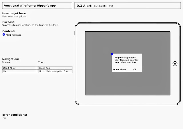
Alert:
I need the user to authorised the App to use their location,and I would do it into the same App.
Example
Main Navigation:
I tried different layouts in order to not make the user think. I feel that it could be simple for the user interact with the Map, instead of the side panel.As wireframe cannot contain pictures I replace the picture of the map, I feel this way is clearer:
By this solution the user just need to tap over the POI on the map, and do not need to search on the side panel. I wanted to simplify the task.
To consider:
- Enable user to zoom map
- 2 => as Back Buttom like circular navigation the user can go back from previous point even from the Home page
- Think a user-friendly text
- 3d Map with 3d Pin (Apple's Map)
More Info:
I wanted the user to choose between different transportation for their route.Following the idea of interactive map.
Directions:
I prefer the solution provide by apple in the way of display the route, a swipe bar. Also I consider that it is important for the user to know how far they are, so I added a progression bar at the bottom.
I wanted the user to be able to control the navigation, so I added some controls for the to start/pause, audio and stop.
I replace the picture of the map, and order the controls as the user would use them.
To consider:
- The user can mute the audio pressing the button on their iPad.
- Change Stop for "Done"
Destination:
The user would have an sign when arrive to destination, and a button to swap their experience to augmented reality. I would need to test this carefully.I replace the picture of the map.
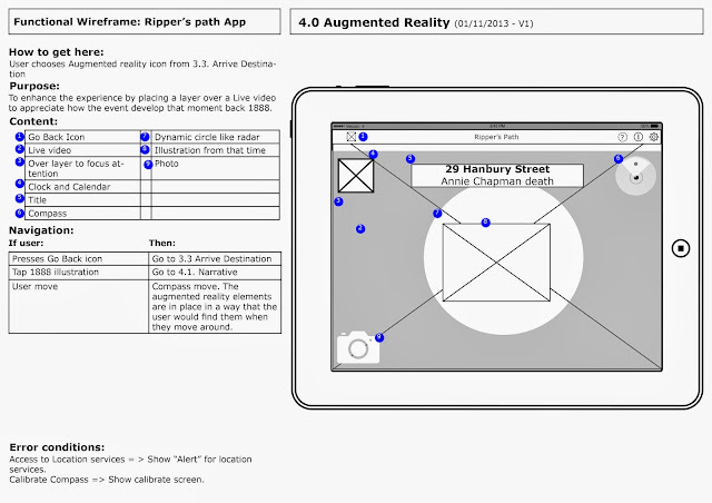
Augmented reality:
Once the user is in the Augmented reality view, I would provide clues to invite them to tap and the story would start. The circle would work as a radar.
I replaced pictures.
Story:
I wanted to add some controls for the user, text and a progression bar.
I tried to simplify the controls...
but even more I try to simplify the general Layout so it would be more consistent with the Directions layout.
I would need to test which (above or bellow) layout work better.
I think that changing the icon stop for "Done" invite more to action and it's more relate with the task.
I replace pictures.
Photo:
I designed a separate page for photo, but in order to simplify I include into the normal AR page, so this was eliminated.==============================================


No comments:
Post a Comment