Colour palette
Moodboard:


Blood Red rgb=#660000 / 960B0B


I found this website talking about the scarlet colour:
I would use this colour palette for first try.
Colour Accessibility
http://www.456bereastreet.com/archive/200709/10_colour_contrast_checking_tools_to_improve_the_accessibility_of_your_design/
I would use this App on my Mac to check for colour blindness

Colour V01
First I wanted to try with bloody colour palette... but it's standing out, it can distract the user
Test Results: The scarlet colour do not affect the app's visibility .
.png)
.png)
.png)
.png)
.png)
.png)
.png)
.png)
.png)
Colour V02
I change the shade of the Scarlet k = 50%:

Test result show that do not compromise accessibility.
.png)
.png)
.png)
.png)
.png)
.png)
.png)
.png)
I checked with a picture... as Live video to see how it works, I would need to see the contrast with a lighter colour Palette


I fill that the right balance between the scarlet, fray and beige, would not be too intrusive for the App. I feel that the scarlet it's too distracting.


This is a lighter version of the Colour Palette, and use the colour for interactivity and at the same time have a feel of the style of the App.


This is the code for my colour palette:
Information area: Background and Text, respectively


Decoration:

Interactive area: Background, Icons or Text.


Subtle drop shadow to interactive boxes in order to create depth and actionable areas visible.


Test Contrast: The only compromise I can see it's the "Decoration colour" it can be lost, but the important interactive area and icons are still visible and it can be differentiated. Also the subtle drop shadow make visible tapeable areas.
.png)
.png)
.png)
.png)
.png)
.png)
.png)
The Grey scale result show a good contrast. Now I'll need to work with the Typography.
.png)
I wanted to see that actionable buttons have the right look, and I'm taking the Almost Flat design approach....


Actions:


Clicked Items


I have to go back and adjust the elements. I notice when you have selected you have highlight the element, but what I did was obscure and it wasn't working for the visual language of the elements.


- Standardise drop shadow, opacity and gradients on the beige elements.
- When the button are click put a Grey overlay.
- When a word is click it, example Back, Help, About, make them clearer
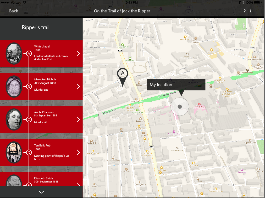
Final Colour scheme


Clicked Items

Colours
Information boxes
Decorations
Interactive items
Opacity 50% for clicked interactive text (Back, Hide, Help, About...)
Gradient for clicked items


Gradient for non clicked items
Review of visual language
I have to go back and adjust the elements. I notice when you have selected you have highlight the element, but what I did was obscure and it wasn't working for the visual language of the elements.
Non clicked items


Clicked items


No comments:
Post a Comment