This layout is is standing out too much in term of interfaces. II wanted a subtle gradient but the minimum that I got was this. Also the two types I was using were fighting for attention.
I checked different apps menus, to check how can I established the hierarchy of the Layout.


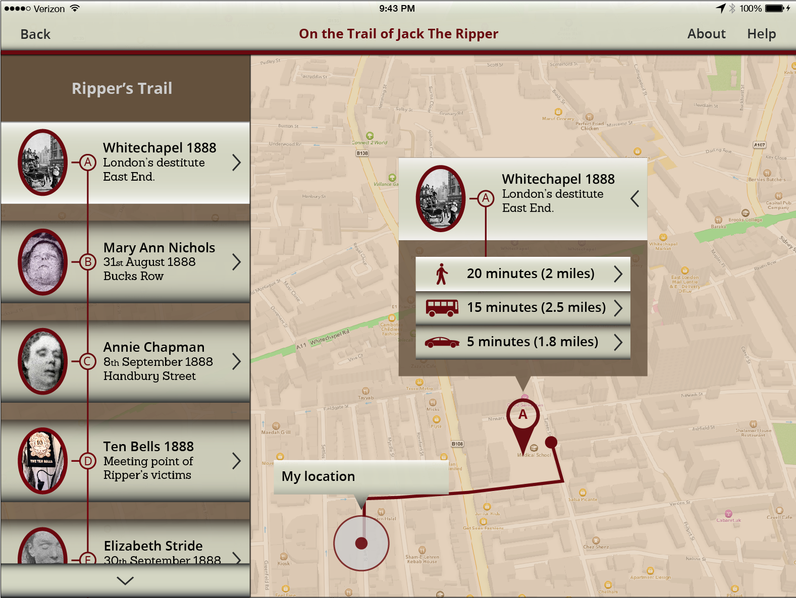
I feel that the final design is more balance and the correspondent hierarchy of the Typeface is more obvious.
I might feel that the arrow are not necessary, as the area looks taxable enough.

Final design
I feel that the final design is more balance and the correspondent hierarchy of the Typeface is more obvious.


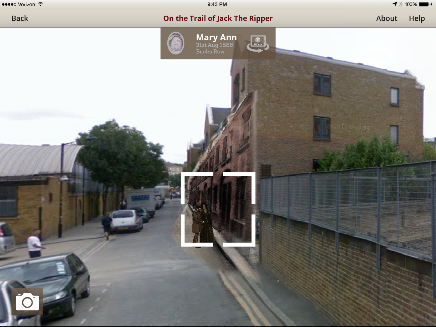
Visual test
The new design also keep a good contrast


No comments:
Post a Comment