Typography
Some advise:
http://ivomynttinen.com/blog/the-ios-7-design-cheat-sheet/- Navigation Bar title: 34pt Medium
- Regular Buttons: 34pt Light
- Table Header: 34pt Light
- Label: 28pt Regular
- Tab Bar icon Labels: 20pt Regular
- IOS font: Helvetica Neue
Make sure all styles of a custom font are legible at different sizes. One way to do this is to emulate some of the ways iOS displays font styles at different text sizes. For example:
- Text should never be smaller than 22 points, even when the user chooses the extra-small text size. For comparison, the body style uses a font size of 34 points at the large size, which is the default text-size setting.
- In general, font size and leading values differ by two points per text-size setting. Exceptions to this are the two caption styles, which use the same font size, leading, and tracking at the extra-small, small, and medium settings.
- At the smallest three text sizes, tracking values are relatively large; at the largest three text sizes, tracking values are relatively tight.
- The headline and body styles use the same font size. To distinguish it from the body style, the headline style uses a heavier weight.
- Text in a navigation controller uses the same font size that body style text uses for the large setting (specifically, 34 points).Text always uses either regular or medium weight; it doesn’t use light or bold.
My settings:
I'm looking for a iOS type that looks long and has different weight available.
Combination => Helvetica Neue with Garamond
Combination => Liberation Sans and Liberation Serif
Expert Sans
Helvetica Neue
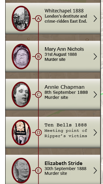
The first two combinations enhance the feeling of historical theme of the App, but compromise readability. I asked two user which are the more representative of historical theme and which one is the clearest. Both gave the same answer: The first one is more historical and the third one it's the best for reading.
I would need to find a typeface similar to Expert Sans that it's compatible with iOS.
Even if the A and D match the theme they are not readable, and taking in mind that people would use this App on the street, I think a good contrast type would improve the usability of the App. The last one is Open Sans is a Humanistic typeface and it's legible and in match with the theme.
http://www.myfonts.com/fonts/latinotype/sanchez/
I found this Typeface called Sanchez, I feel it complement well Open Sans.
I would need to find a typeface similar to Expert Sans that it's compatible with iOS.
I tried PT Sans and PT Serif, Arial, Verdana and Courier.
Final Choice:
http://www.myfonts.com/fonts/latinotype/sanchez/
I found this Typeface called Sanchez, I feel it complement well Open Sans.
Typeface:Open Sans with Sanchez
Heading text in navigations controller (Labels, Buttoms): 34 pt Medium weight
Body text in Navigation Controller: Sanchez 30pt Regular
Story:
Story:


No comments:
Post a Comment