Storyboards flow
Launch Image
The App need to have a Launch image. According to Apple Guidelines and Nielsen this should be as similar as possible to the first page so the user would have the feel in that the App is loading fast. So I would use a my Launch image this.
Main
In order to decide colour and typeface, I used this page because have the main interfaces for my story.
POIInfo
I was designing this page when I realise that the option that is selected should stand out rather than non select,
so I'll change the feedback for this interaction.
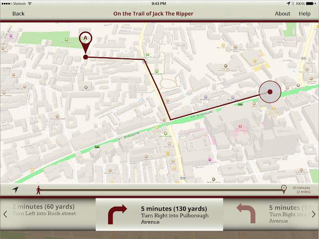
Directions
This design it's taken too much from the map... I'll try anotherI made the progression bar Interactive as the user can refresh their current location, and also the same layout could be use for the story. I want my interfaces as simple as they can be and consistency.
Destinations
The Location icon it's too close to the edge, so I leave a breath space on one side.

Augmented Reality
Help
This would be an animation that would appear the first Time, the iPad drawing would be moving sideways, when the user press back this screen would minimise under the Help icon, where the user can see the compass... them the user can access through Help
I asked a user what they think this mean, they answer that the App provide a 360 Panorama and that they should tap there in other to activate the view. Well I should say to the developer that the user can tap here or back button in order to see the video.Also I'll add some opacity
Find Augmented reality points
First I though some blur semicircle coming from one side of the screen, where the user have to turn, but I think it's not the right solution aesthetically
Then, I though half of box opening a closing on the direction of the user need to turn.
But I still not happy on how it looks. I would leave the box in other to invite the user to tap. But instead I would improve the help screen in order to introduce better my circle icon. Look and Google glass:
Story (Play/Pause)
end of the story


No comments:
Post a Comment