User testing
Audience test initial ideas 10/10/13
I asked one potential user of the App (part of my audience) what the would prefer a fiction account or a non fiction based on the witness, and she mentioned that could be interesting follow the Ladies that been murdered, and used the account of the witnesses to relate the story.
Another potential user would prefer to see the victims journey home follow the events after she is being discovered, audio with the noise open door, steps out, killing, use shadows... as you get closer to the place the victim pass close to you, tap on the shoulder and introduce herself and her story. With the victim you can appreciate what was her life, her profile, the user said that it so little said about them.
I carry out a test to check how the interfaces are working. I prepare some forms based on http://www.usability.gov.


I can summarise the changes that I would need to carry on my design, in order to improve its Interface.


================================================
================================================
Interfaces 07/11/13
I carry out a test to check how the interfaces are working. I prepare some forms based on http://www.usability.gov.


Main Page
- Use a "Almost Flat design" instead of a Victorian style full of texture. I want the user to concentrate on the content, and do not to get distracted with the Layout.
- Animate the Pin when somebody tap on a Location.
- As people tend to tap on the Location box - precisely where the picture is, I think it could be irrelevant to have the arrows at the end.

- As people tend to tap on the Location box - precisely where the picture is, I think it could be irrelevant to have the arrows at the end.
- Clarify the copy text on the Locations. Murder site... Building...
Location Info
- Use a "Almost Flat design" instead of a Victorian style full of texture. I want the user to concentrate on the content, and do not to get distracted with the Layout.
- Delete description of the Location in the information box as People didn't notice description or read.
- Use an icon for a Bus instead of a Train.
- Place icons vertical with the information to one side.
- Use complete words instead of short. Example min => minutes and mi => Miles.
Directions
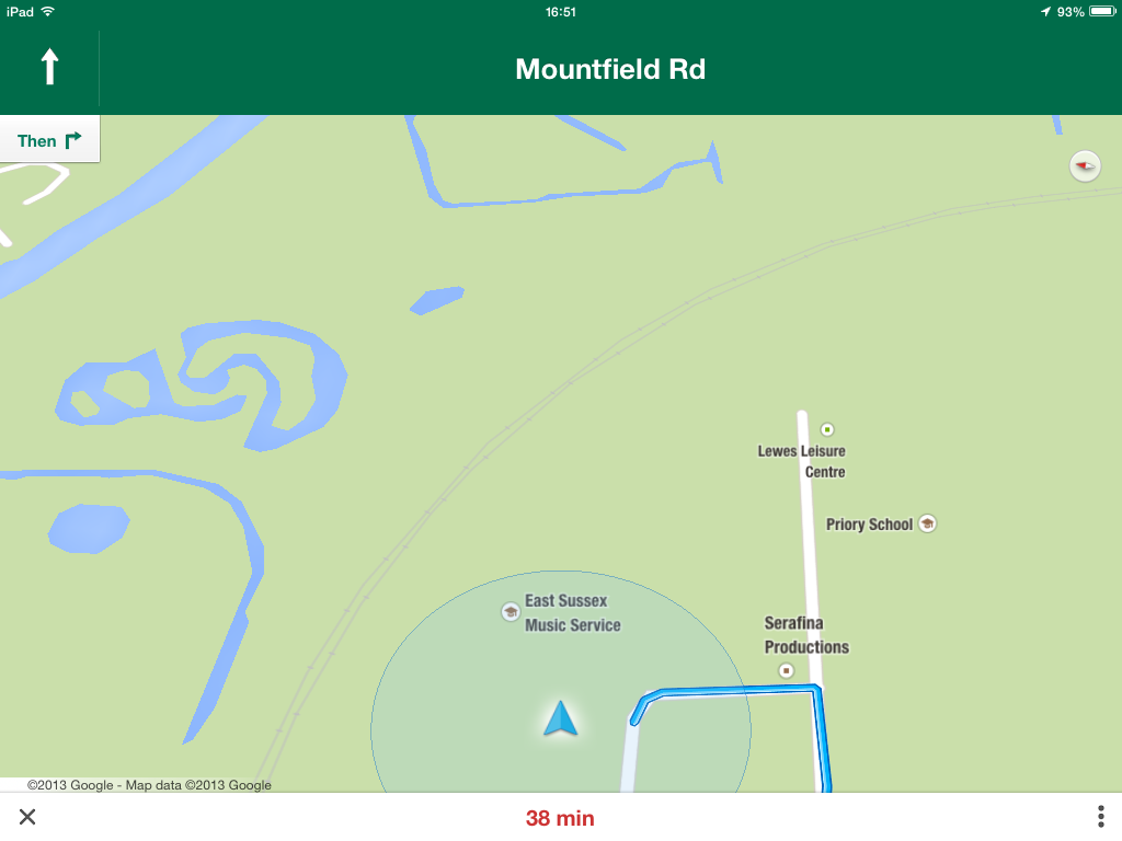
- Change the Layout of the progression bar and the position on top of the directions as people tend to ignore this information. Also, it should look complete flat so the user would not be tented to tap.
- Some user suggested the arrow at the side irrelevance, and also put "Previous" and "Next" to the Last and Next direction, in order to not create confusion. According to Nielsen the cues should be there for swipe elements, so I would keep them. Google directions layout is more intuitive and simple, Google the user would need more steps to carry out the task


Augmented reality / Live Video
- Keep clock and compass, it would enhance then experience, but they would look according to the Almost flat design.
- Consider use a one time overlay to sign a 360 Live view, or a gesture silhouette figure with an iPad turning around to find the AR, or an animated arrow disappearing to the side the user needs to turn around.
- Redesign the spot light in a way that when it's getting closer to the target it would get lighter otherwise darker. Like hot/cold game.
================================================
No comments:
Post a Comment